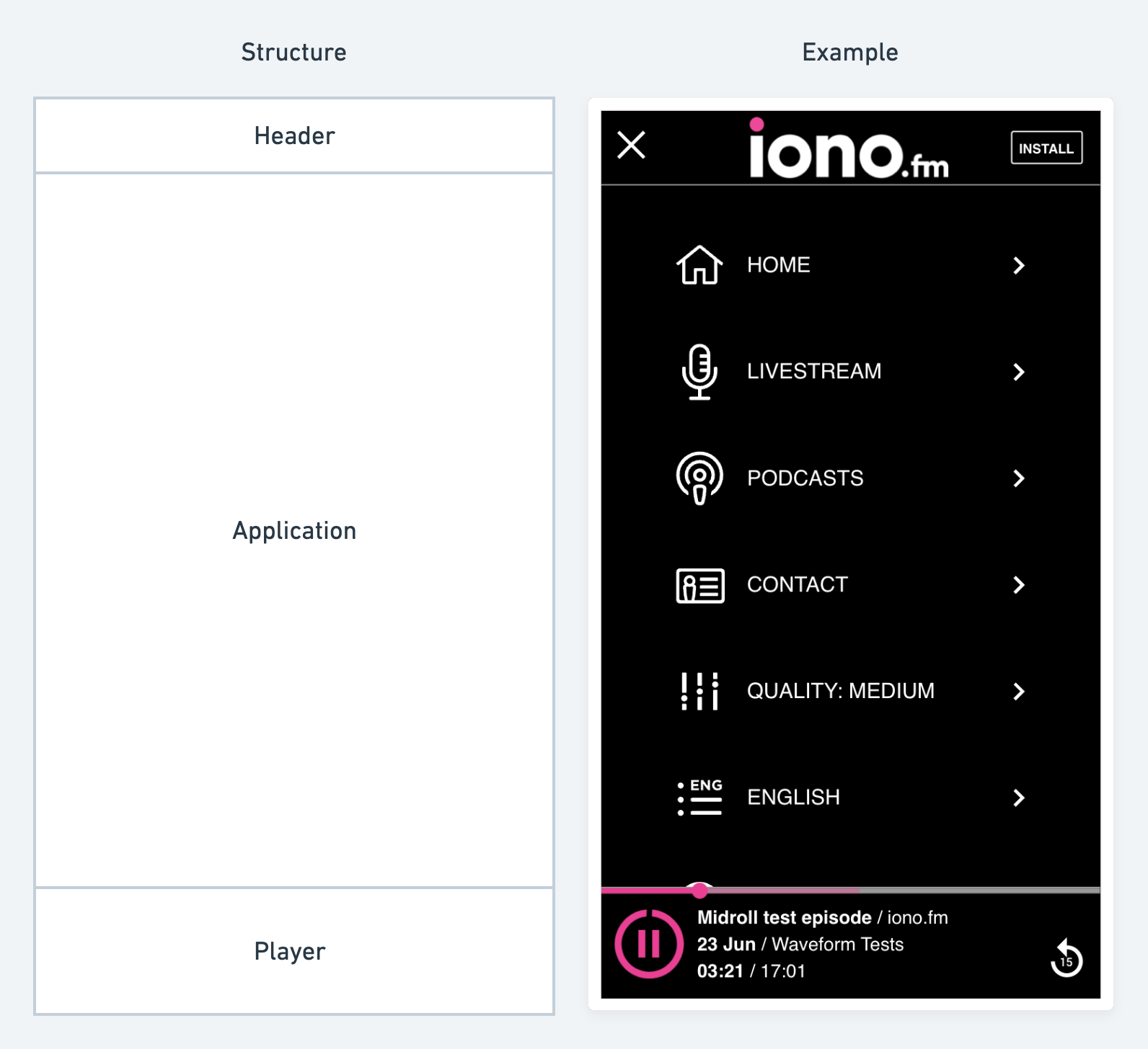
The web application is served from a standard template that can be themed and customised for each customer.
The application has 3 main sections: the "Header", "Application" and "Player" areas. Application theming can control the colours and images used by his framework.

Colours
Customers can change 5 colours in the application:
- Header Background Colour
The background colour of the header area of the application.
- Header Text Colour
The text colour used in the header.
- Application Background Colour
The background colour of the application and player areas of the application.
- Application Text Colour
The text colour used in the application and player areas of the application.
- Highlight Colour
The highlight colour is used when hovering over any link or menu item in the application, for the "play" icons and to show active tabs. This should be a strong colour that stands out well on both the header and application background colours.
Specifying colour codes
When specifying these colours we require HEX colour codes, which typically looks like #FAC301. If you have RGB colours you wish to convert to HEX or just want to browse for appropriate colours, we recommend this website:
Some customers may know their key brand colours, but if you have only a logo available, you can use this site to upload your logo and extract some of the key colours:
Picking a colour theme
When picking a colour theme, the main choice is whether you want a "dark" or "light" theme. A "light" theme will use a light background colour with dark text and icons on top of that, for example standard black text on a white background. A "dark" theme will use a dark background colour with light text and icons on top of that, ex: dark blue background with white text and icons.
Images
An application can specify 3 images:
- Application Icon
This image used on the app stores and the phone home screen. This should be an icon that displays well at a small size. A good example would be the "favicon" used for a website.
Requires a square PNG or JPG image 1400x1400 in size. Defaults to the provider logo if no image is provided.
- Home Screen Logo
This image is displayed on the main application home screen and on the splash screen while the application is loading. It will always be displayed full size and can contain a more detailed image than the icon.
Requires a square PNG or JPG image 1400x1400 in size. Defaults to the application icon if no image is provided.
- Header Banner
This image is displayed inside the top application "header" area. It is the main branding element visible while using the application.
Requires a square PNG image 300x100 in size. Defaults to the applicaiton name in text if no image is provided.
The application icon and splash screen image is built into the application, to change these requires a rebuild and republish to the app stores. The header banner logo and home screen logo can be changed later without requiring a rebuild.
Image sizes
The app stores requires large image sizes, and sometimes a customer may not have their logo available in the required 1400x1400 resolution. Scaling up an image in a traditional image editor will introduce a lot of noise and "blocky" artifacts. We recommend using an AI upscaler that can increase image sizes without introducing these issues: